Goldmaster
A production dashboard for indie game studios.
Project Overview
The short version.
Goldmaster is a project management dashboard designed specifically for small indie game studios — the teams of 2–5 people making real games on tight budgets, tight deadlines, and zero tolerance for tools that get in the way.
It covers five core areas: project overview, task board, milestone tracking, bug logging, and team coordination. It was designed in Figma, built in HTML/CSS/JS, and deployed live on GitHub Pages.
This project demonstrates my Package 4 offer — end-to-end product design and frontend implementation — from blank brief to working product.
The Problem
The tools don't fit the people.
Small indie studios are stuck between tools built for the wrong users. Goldmaster is built around the one question every project lead wakes up asking: Are we on track?
Jira
Designed for enterprise engineering teams. Powerful, expensive, and takes days to configure. A four-person indie studio doesn't have a Scrum Master. They have a developer who also writes the design brief.
Trello
Too simple. No milestone tracking. No build versioning. No game-specific vocabulary. Everything has to be hacked together with custom labels and workarounds.
Notion
Flexible but demanding. Every team builds their own system from scratch, and that system needs constant maintenance. Time spent organising the tool is time not spent making the game.
Spreadsheets
What most small studios actually use. They work, but they don't scale, they don't surface blockers, and they don't answer the one question every project lead wakes up asking.
The User
Kaito, project lead at PixelForge Studio.

Kaito
Lead Developer & Project Manager · PixelForge Studio, Tokyo
PixelForge is a fictional four-person indie studio building their first commercial title. Kaito is the lead developer — and by default, the project manager. He wears too many hats. He codes, he reviews, he tracks progress, he keeps the team moving. He doesn't have time for a tool that requires maintenance.
He needs to open the dashboard, understand the situation in under five seconds, and get back to work.
His goals
- Know exactly where the project stands at any moment
- Catch scope creep before it becomes a crisis
- Keep the team aligned without daily standups
- Ship on time — or at least knowingly late, not accidentally late
His fears
- Crunch that could have been prevented
- A blocker nobody flagged until it was too late
- Losing track of which build introduced which bug
His tools before Goldmaster: A Notion doc that stopped being updated in week three, and a spreadsheet he built himself and hates.
Research
Real problems, real sources.
This is a concept project with a fictional client — but the problem is real. Indie game development is well-documented, and the pain points around production tooling come up consistently in the community.
Sources referenced
- GDC postmortems — public talks where developers reflect honestly on what went wrong
- r/gamedev — threads about production workflows, crunch, and tooling frustrations
- itch.io developer blogs — indie studios writing about their processes
- Blood, Sweat, and Pixels by Jason Schreier
Key patterns
Scope creep is the number one killer
Studios consistently underestimate tasks and don't notice the drift until they're deep in crunch. A tool that surfaces completion percentages per milestone makes drift visible earlier.
Game dev has its own language
Alpha, Beta, Gold Master, build number, QA pass — these terms mean specific things. A tool that uses generic PM language creates friction. A tool that speaks the same language removes it.
Small teams need visibility, not hierarchy
Nobody needs to assign tickets to managers. They need to see what everyone is working on, what's blocked, and what's next.
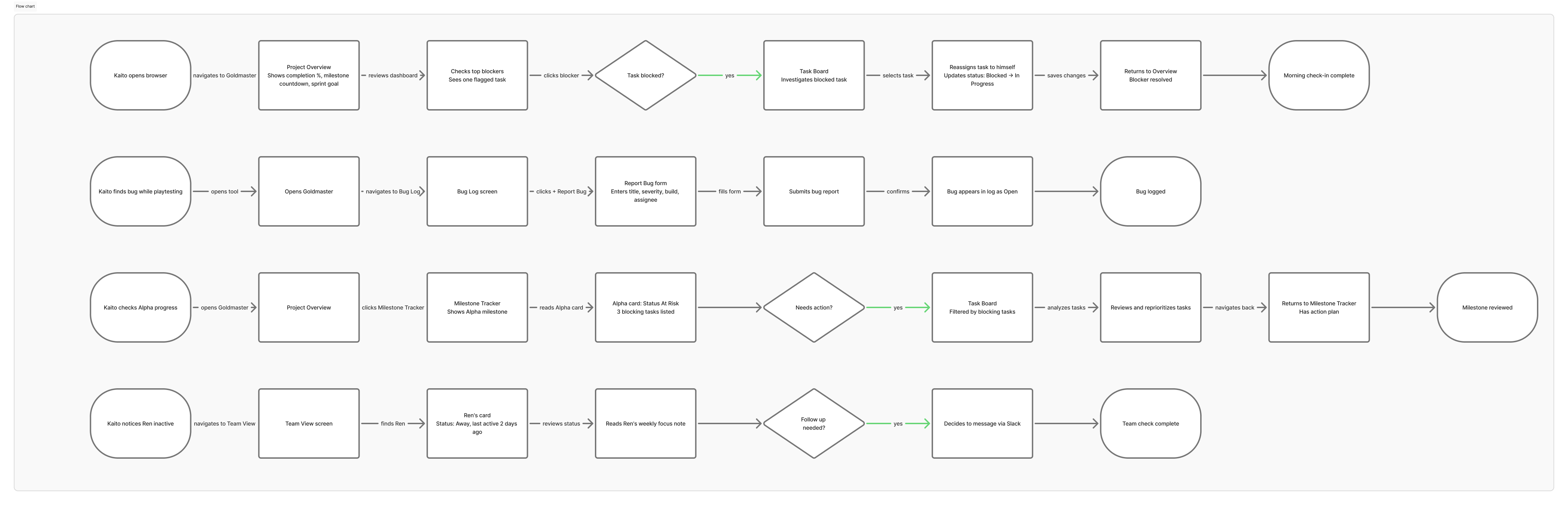
User Flow
Design System
Built before any screen was designed.
Color
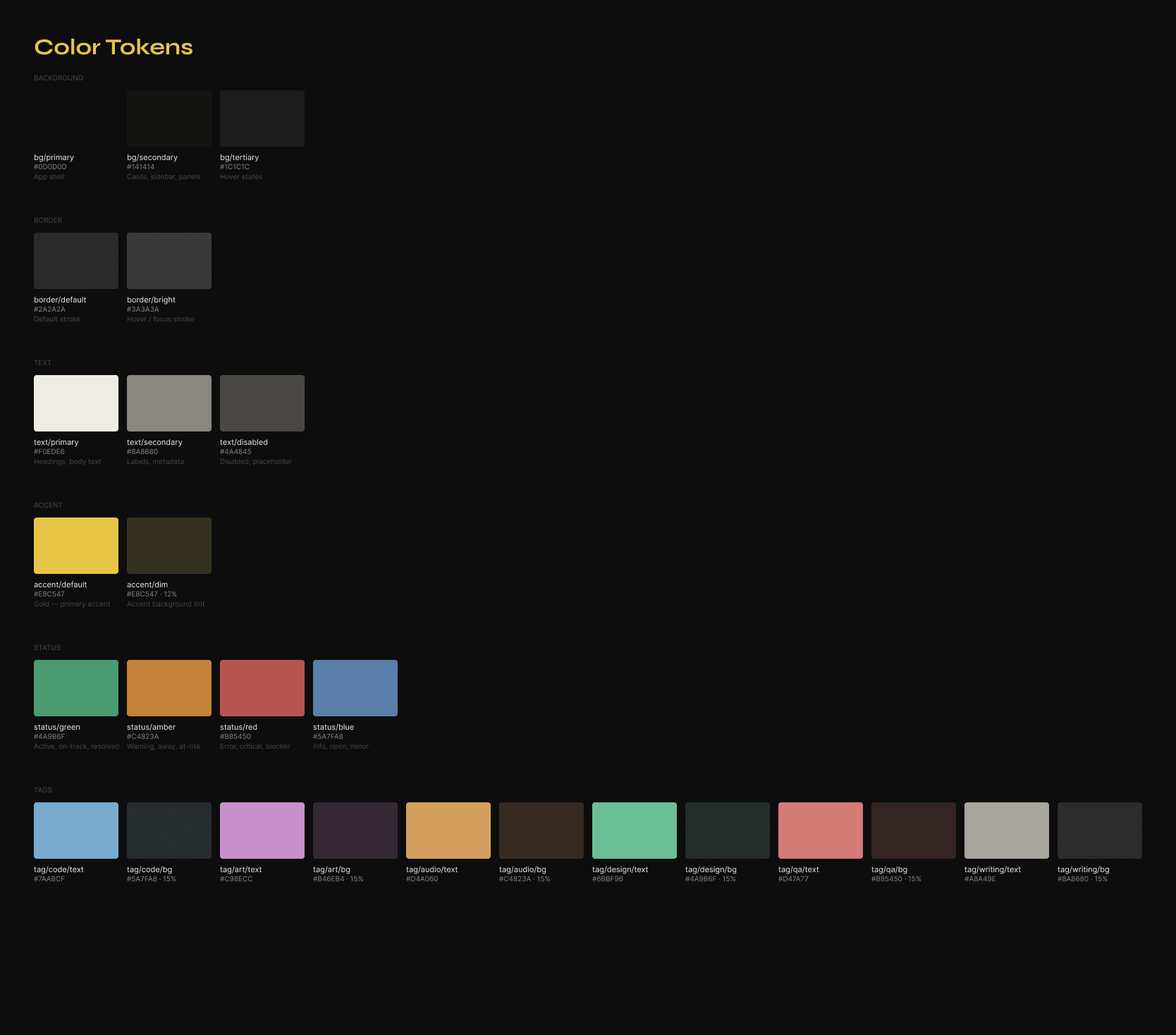
Near-black backgrounds (#0D0D0D, #141414, #1C1C1C) with a single gold accent (#E8C547). The gold connects directly to the product name — gold master, the moment a game is finished and ready to ship. Status colors are muted versions of standard red/amber/green — the UI stays calm even when the data isn't.
Typography
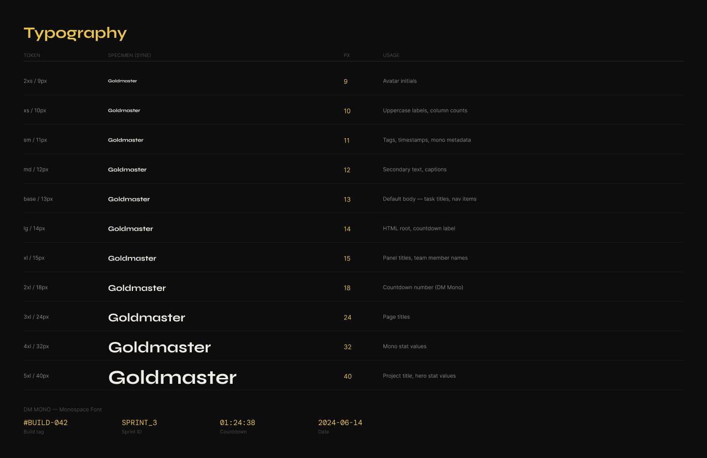
DM Mono for all data, numbers, build versions, and code-adjacent labels. Syne for headings, navigation, and UI labels. The combination reads as technical and editorial — a tool made by someone who cared.
Components built
Navigation · Card shell · Task cards (all states) · Type tags · Status badges · Severity badges · Progress bar · Avatar with status dot · Buttons · Filter pills · Table rows. Every component was built with Auto Layout in Figma. The file is handoff-ready.
The Screens
Five screens. One question answered per screen.
Screen 01
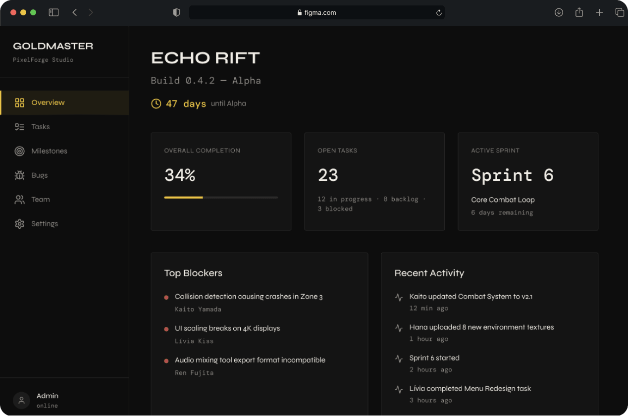
Project Overview
"Are we on track?"
The dashboard home. Every element is chosen to answer one question as fast as possible. Game title, build number, overall completion, days until next milestone, active sprint goal, top blockers, team status. Nothing else. The three top blockers are the most important design decision on this screen — instead of burying blocked tasks in the task board, they surface here automatically.
Screen 02
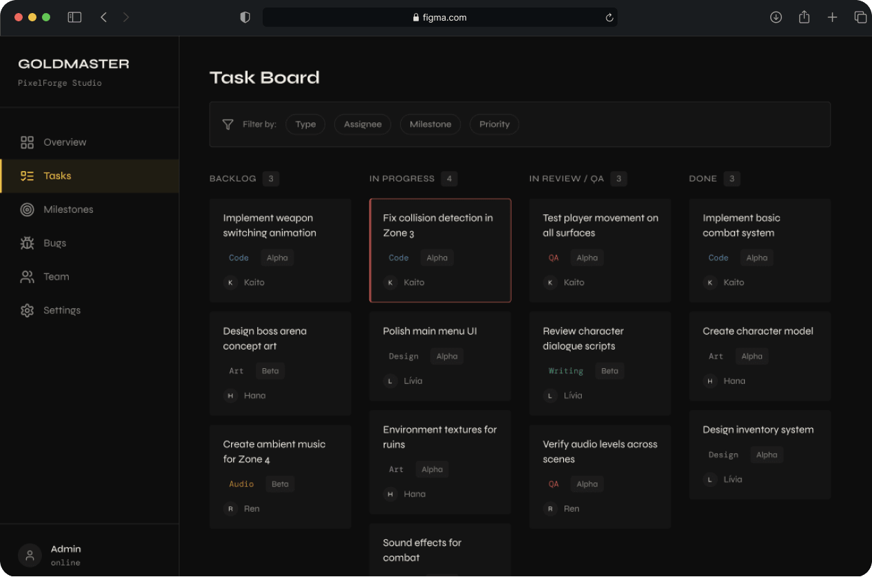
Task Board
"What is everyone working on?"
A kanban board structured for game development — not generic PM work. Columns are Backlog, In Progress, In Review/QA, and Done. Tasks are tagged by type: Art, Code, Audio, Design, QA, Writing. The type tags solve a real problem — in game dev, a "blocked" task means something different depending on whether it's a code dependency or an art asset waiting on a brief. Drag-and-drop is implemented in JavaScript.
Screen 03
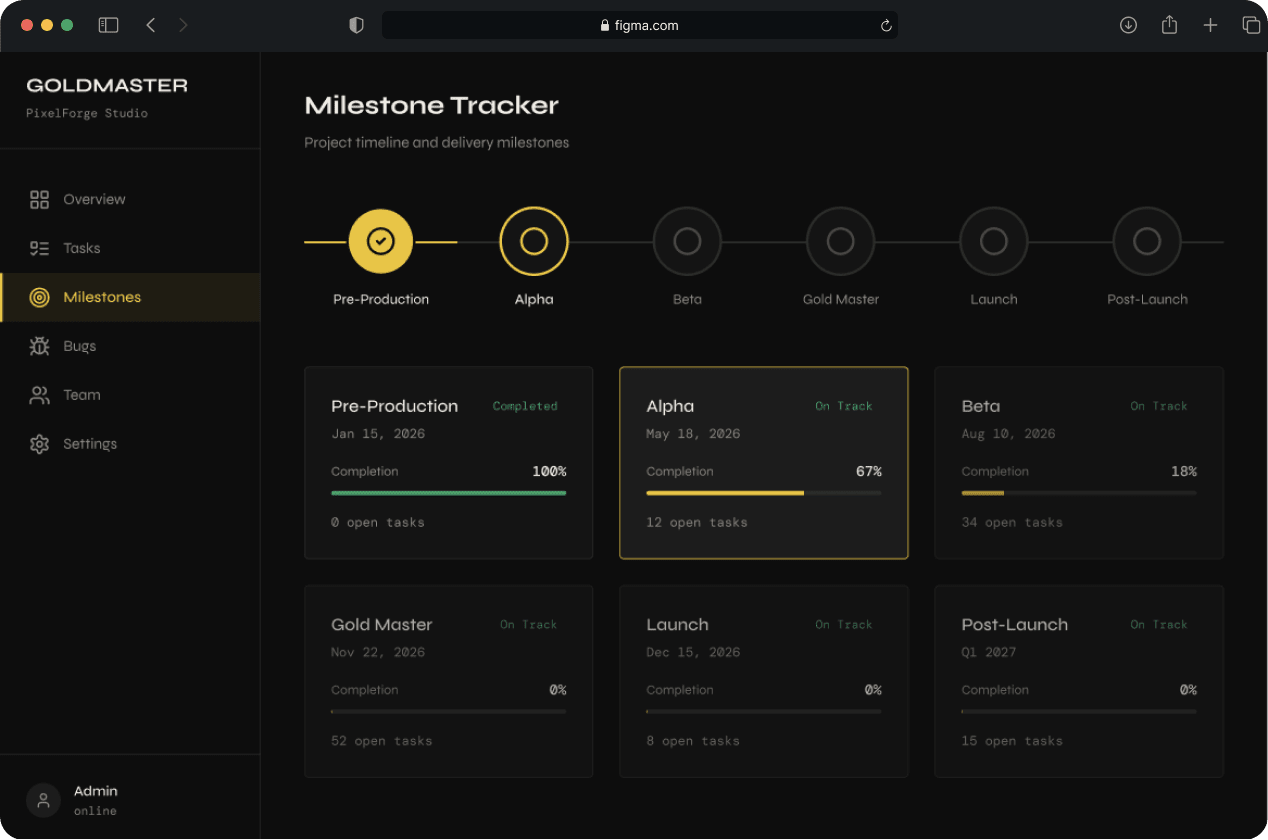
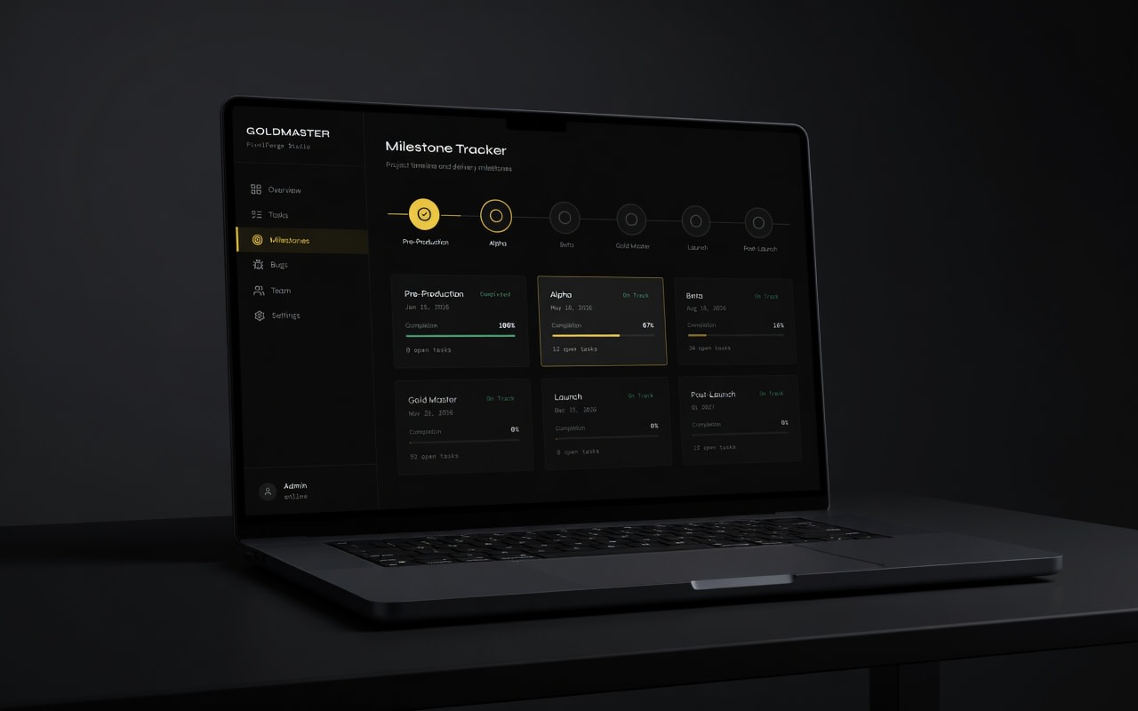
Milestone Tracker
"How far are we from shipping?"
A horizontal timeline running from Pre-Production through Post-Launch. Completed milestones are filled with the gold accent. Below the timeline, each milestone has a card showing target date, completion percentage, status (On Track / At Risk / Delayed), and the number of open blocking tasks. The design intent was to make the timeline feel like a map — not a progress report. A navigation tool.
Screen 04
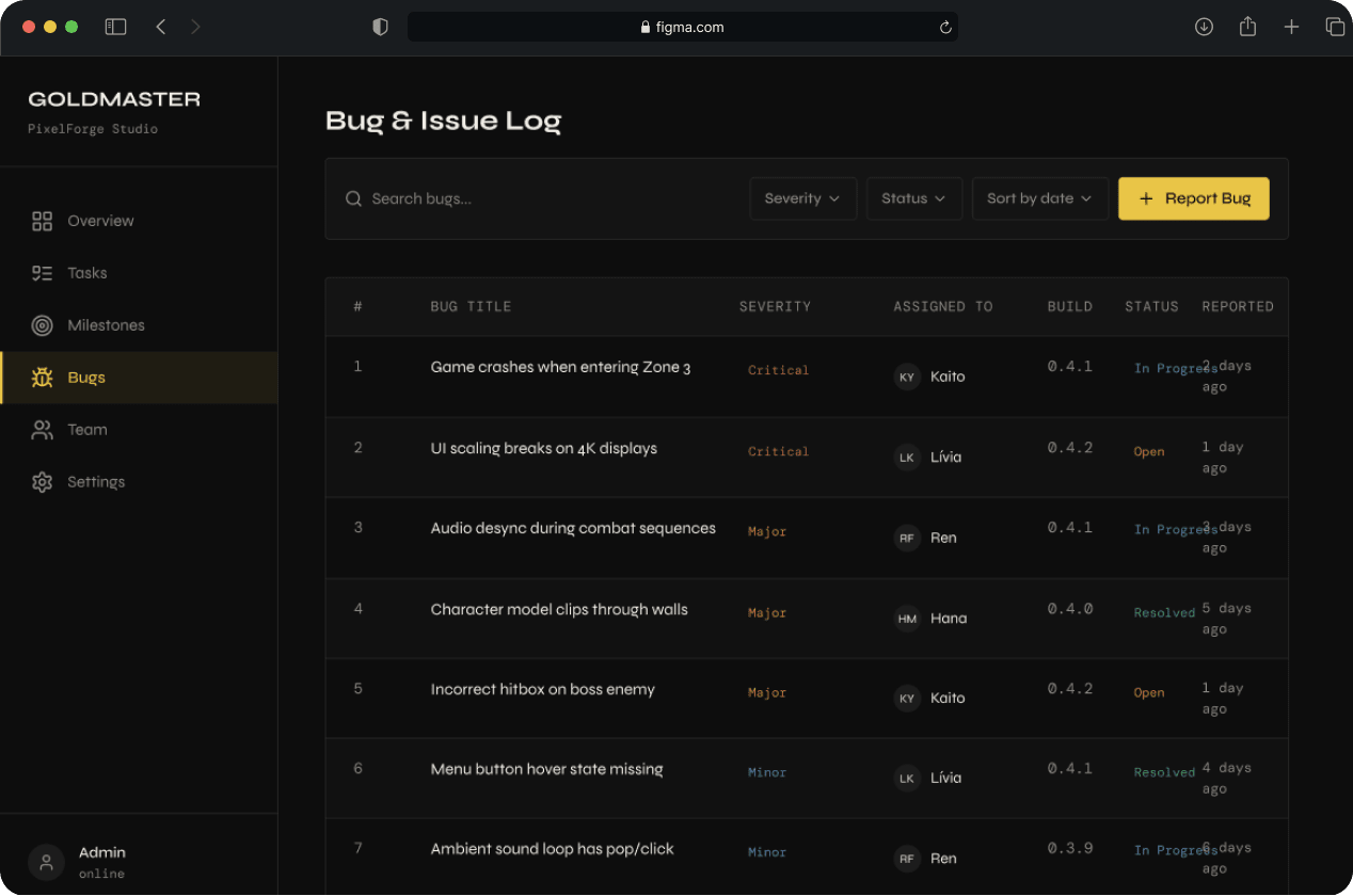
Bug & Issue Log
"What is broken and who owns it?"
A clean data table. Bug title, severity, assigned to, build number it was found in, and current status. Rows are 52px — readable but dense. Sort by severity. Filter by status. Quick-resolve toggle on each row. The build number column is a small but important detail — in game development, knowing when a bug was introduced is as important as knowing what it is.
Screen 05
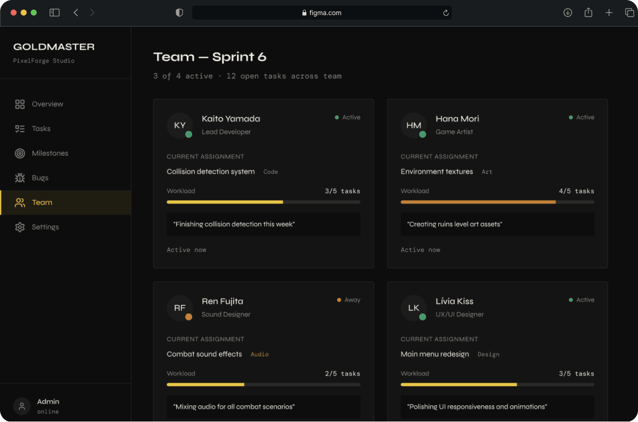
Team View
"Is everyone okay?"
Four team member cards. Each shows name, role, current assignment, capacity indicator, a personal focus note, and last active timestamp. This screen is explicitly not a time-tracking tool. The design intent is coordination, not surveillance. The personal focus note — a short freetext field where each team member writes what they're focused on this week — came directly from research.
The Build
Designed in Figma. Built in HTML/CSS/JS.
All five screens were built as a responsive frontend in vanilla HTML, CSS, and JavaScript. No frameworks. No libraries except SortableJS for drag-and-drop on the task board.
- CSS custom properties for all colors, type sizes, and spacing — the entire visual system lives in :root
- Sidebar is a fixed component shared across all screens
- Progress bars animate on page load with CSS @keyframes
- Milestone timeline built with pure CSS — no canvas, no SVG library
- Task board drag-and-drop implemented with SortableJS
- Fully responsive — works on tablet and mobile
- Deployed on GitHub Pages
Reflection
What I would do differently with a real client.
This project was self-directed, which gave me freedom but removed something important — friction. A real client would have pushed back. They would have had constraints I didn't anticipate, preferences I would have had to design around, and business goals that might have changed the priorities entirely.
What I learned
- Writing the brief before opening Figma was the single best decision. It forced design decisions before I was tempted to just make things look good.
- Building the design system before the screens made the whole process faster and more consistent. Components first, screens second — that's the order that works.
- The coded frontend taught me things the Figma file couldn't. The gap between design and implementation is where the real craft lives.
What I'd build next
- User authentication and persistent data
- A "crunch alert" that flags when a milestone is at risk based on current task velocity
- Notifications for blocked tasks and overdue milestones
That's the feature that would make Goldmaster genuinely useful, not just visually compelling.