Pantry
Your household, in sync.
A shared household management app for couples and small households — designed to capture the invisible coordination that real homes run on.
Project Overview
What is Pantry?
Pantry is a shared household management app designed for couples and small households. It combines a live shared grocery list, a pantry tracker with expiry notifications, recurring item cycles, and a saved items library with photos and store notes.
This project fills the mobile app gap in my portfolio. It started from a real frustration — and that made every design decision easier to justify.
The Problem
Grocery apps solve the list. They don't solve the household.
Shared households run on invisible coordination. Who bought the milk? When did we open this yogurt? We're out of cleaning spray again. Can you grab oats — but the right oats?
This coordination currently lives in WhatsApp messages, sticky notes, and "I thought you knew." It's fragmented, forgettable, and frustrating.
Most grocery apps treat shopping as a solo task with optional sharing bolted on. They miss three things:
01
Food waste
Things go bad because nobody tracked when they were opened or how long they last.
02
Rhythm items
Cleaning spray, shampoo, vitamins. Supplies that run out on a predictable cycle but never make it back onto the list until you're already out.
03
Shared knowledge
Which brand, which size, which shelf. That knowledge lives in one person's head and gets lost every single time.
Pantry is built around one idea: a household is a team, and the kitchen is where that team operates.
The Users
Sophia & Joe. A real problem, fictional names.

Sophia
The planner
She does most of the grocery shopping mentally before she ever leaves the house. She knows which oats she wants, where they are in the store, and roughly when they'll run out. The problem is getting that knowledge out of her head and into a shared system Joe can actually use.
Joe
The executor
He's happy to shop, cook, and restock — but only if the information is clear and visual. He doesn't want to text "which oats?" standing in the middle of a store. He wants to open the app and just know.
Their shared goals
- Stop buying things they already have
- Stop running out of things without noticing
- Stop the "which one did you mean?" messages
- Reduce food waste without thinking about it
Process
How I worked.
This project followed a brief-first approach — I wrote the full project brief, defined the user, mapped the problem, and outlined every screen before opening Figma. That order matters. It meant every design decision had a reason before it had a layout.
Brief & problem definition
Defined the user, the problem space, the core features, and the design goals in writing first. No wireframes, no Figma — just clarity.
User flow mapping
Mapped 4 core user flows before designing any screen. Each flow follows a specific scenario — adding an item, logging a purchase, setting a recurring item, checking the pantry. The flows made it clear which screens were essential and which were nice-to-have.
Design system in Figma (with Claude Design)
Built the full design system before touching any screen frame. Colors, typography, spacing, and every component were built as reusable Figma components first. I used Claude Design to accelerate the design system build, then refined every decision manually in Figma.
Screen design in Figma
Designed all 16 screens using the design system components. Auto Layout throughout. Every layer named. Handoff-ready from day one.
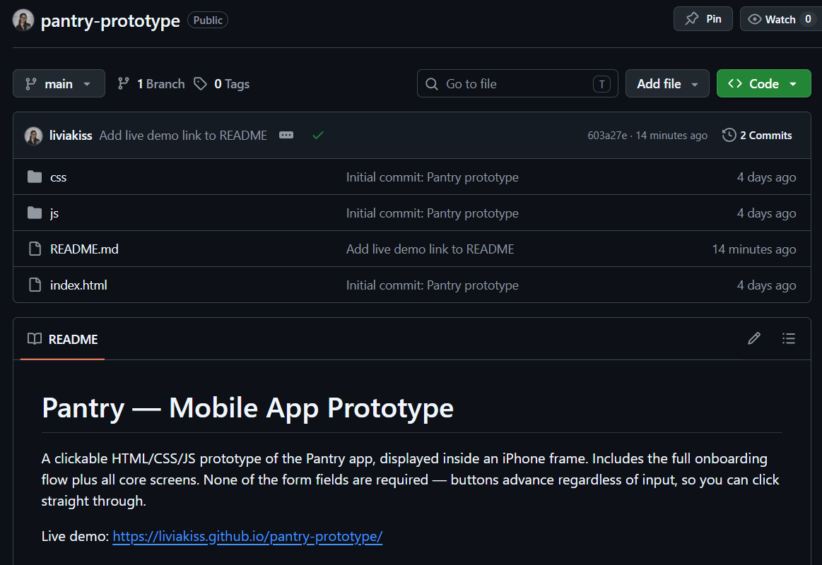
Coded prototype
Built a working prototype in HTML, CSS, and JavaScript — no frameworks. Wrote and edited all code in VS Code, version controlled with Git, deployed via GitHub Pages.

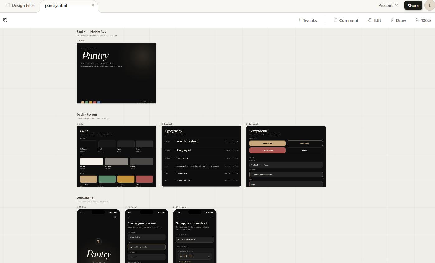
Design System
Built before any screen was designed.
Near-black backgrounds (not pure black) paired with a warm sand gold accent. The accent is the color of candlelight, not a notification badge — domestic, not sharp. Status colors are muted so the UI stays calm even when the data isn't.
Fraunces was the typography decision that made the whole thing feel warm rather than cold. Paired with DM Sans for UI and DM Mono for data, the system reads as premium but approachable.
Backgrounds
Accent & status
Typography
Fraunces — warm, considered serif
DM Sans — clean UI labels and body
DM Mono — timestamps and data
Components built
Bottom navigation · List item row (unchecked + checked) · Saved item card · Pantry item row with countdown badge · Input field (default, focus, error) · Buttons (primary, secondary, destructive) · Bottom sheet shell · Notification card · Avatar with presence indicator · Countdown badge (green, amber, red) · Recurring item card · Tag/badge system.
User Flow
Four flows. Every screen justified.
Before any UI was designed, four core user flows were mapped. These flows determined which screens existed, what each screen needed to contain, and what the navigation structure should be. Nothing was designed that didn't serve one of these flows.
Flow 1 — Add item to shopping list
Sophia opens the app → goes to shopping list → taps + → searches saved items → finds oats → taps to add → item appears on Joe's list instantly.
Flow 2 — Log a purchase and set expiry
Joe gets home from shopping → opens pantry tracker → taps "log purchase" → selects item → sets purchase date and use-by window → saves → app schedules notification.
Flow 3 — Set a recurring item
Sophia notices the cleaning spray is almost out → opens recurring items → taps + → sets product and 4-week cycle → saves → app will auto-add in 4 weeks.
Flow 4 — Check expiring pantry items
Joe gets a notification → opens pantry tracker → sees yogurt is expiring tomorrow → checks the shopping list → it isn't on it yet → adds it.
Flow diagram
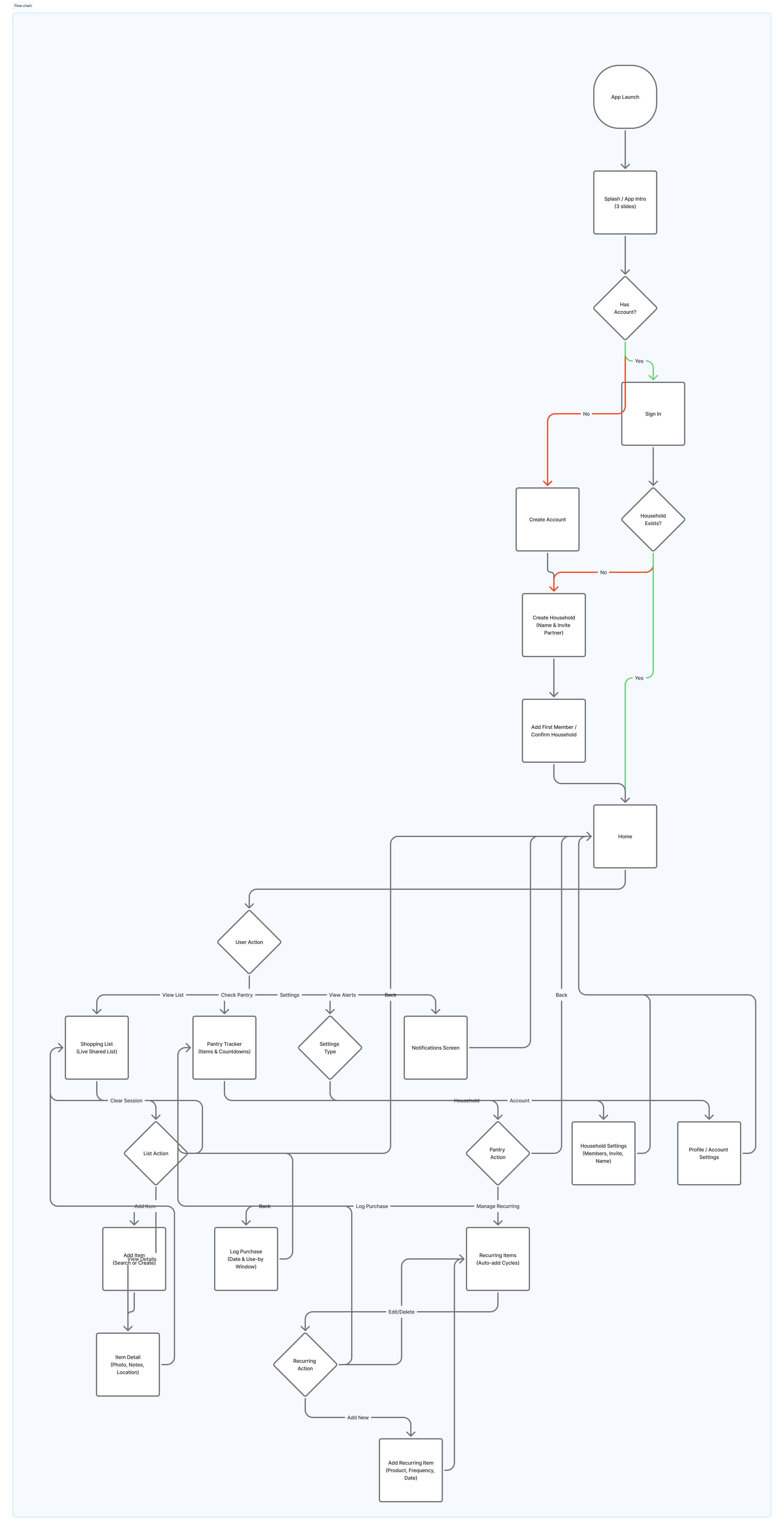
↕ Scroll to explore
Key Screens
Four screens. Each one solving something specific.
Screen 01
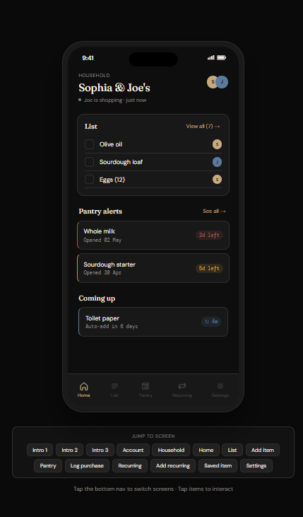
Home — the household hub
List preview, pantry alerts, upcoming recurring items — in order of urgency. If something is expiring, it's the first thing you see. The presence indicator shows if your partner is currently shopping. The home screen answers three questions in under five seconds: what do we need, what's about to go bad, what's coming up.
Screen 02
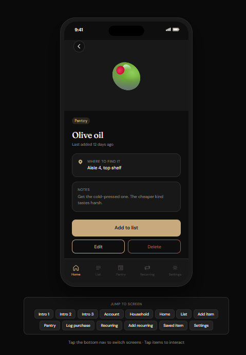
Item Detail — the hero screen
This is the feature that makes Pantry different. The store note — "Third shelf, left side, near the window. Ask for it warm if it's after 4pm" — captures shared household knowledge that currently lives in a WhatsApp message and disappears three days later. Large photo, category badge, store note in a visually distinct card, general notes below. Everything Sophia knows about this item, available to Joe in three seconds.
Screen 03
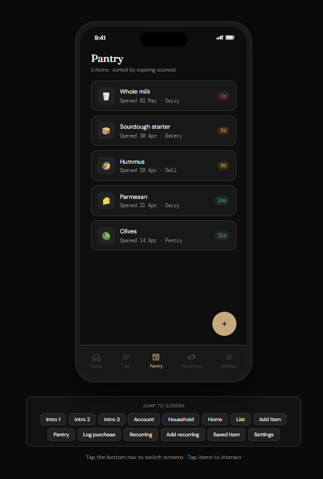
Pantry Tracker — calm urgency
All logged items with countdown badges — green, amber, red. Sorted by expiring soonest by default. The color communicates everything before you read a single word. Status colors are muted — the UI stays calm even when the data isn't. One quiet notification per item, not a daily alarm.
Screen 04
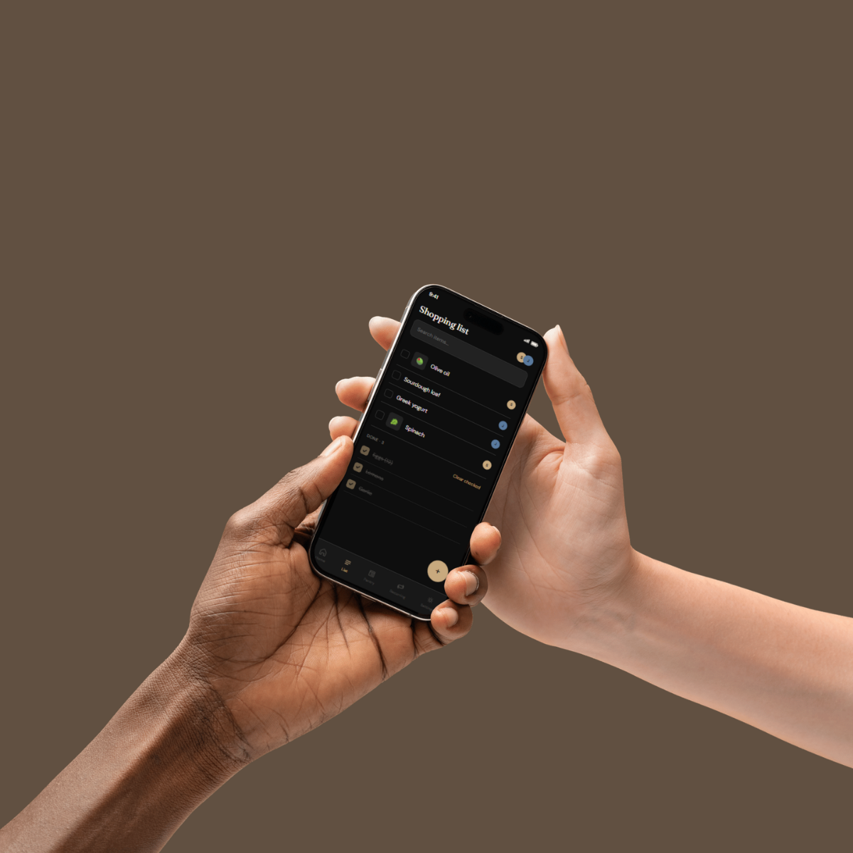
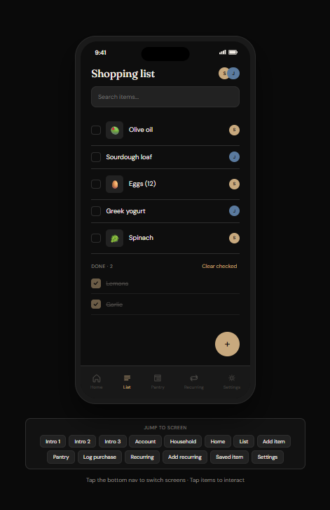
Shopping List — shared, live, honest
Checked items stay visible with strikethrough until the session is cleared. In a shared shop, one person checking something off while the other is still walking toward it creates confusion. Keeping checked items visible until session clear solves that — a small detail that came directly from mapping the real use case.
Prototype
Designed in Figma. Built in HTML/CSS/JS.
The prototype is a coded frontend — not a Figma click-through. All screens built in vanilla HTML and CSS, interactions handled in JavaScript. No frameworks. Version controlled with Git, deployed on GitHub Pages.
Why coded instead of Figma prototype
A coded prototype shows what a Figma file never can — that the design actually works in a browser, that the spacing holds at real pixel density, that the interactions feel right when you use your actual fingers. It also directly demonstrates frontend skills alongside design skills.
Reflection
What I learned. What comes next.
The store note was the insight that unlocked everything.
Originally Pantry was just a smarter grocery list. The store note feature came from a real moment — sending a detailed voice message to explain which exact product to buy and where to find it. That information deserved to live in the product permanently, not disappear in a chat. Once that feature existed, the whole product made more sense. It became about shared household knowledge, not just shared lists.
Brief first, Figma second.
Writing the full project brief before opening Figma forced clarity before creativity. Every screen had a reason to exist before it had a layout. This is now how I start every project.
Dark and warm is harder than it sounds.
Making a dark UI feel domestic rather than clinical required more iteration than expected. The accent color went through several versions. Early iterations felt like a fintech app. Fraunces was the typography decision that finally made it feel right — warmth comes from type choices as much as color.
Claude Design as a process tool.
Using Claude Design to accelerate the design system build was genuinely useful — it generated a strong starting point that I then refined, adjusted, and made my own in Figma. It's a tool, not a replacement for decisions. Every color, every type choice, every component still required judgment. It just meant I could spend that judgment on the right things faster.
What Phase 2 looks like.
Recipe suggestions based on pantry contents — the feature everyone asks about first, which is exactly why it's not in v1. Also: barcode scanning for faster item logging, and smart use-by estimation by category so you don't have to set the window manually every time.
What a real client would change.
A real Sophia and Joe would have opinions I don't have access to. They might not care about recurring items. They might find the home screen too dense. This is a design hypothesis, not a validated product. The next step is usability testing with real couples — and I'd expect at least half of my assumptions to be wrong in interesting ways.