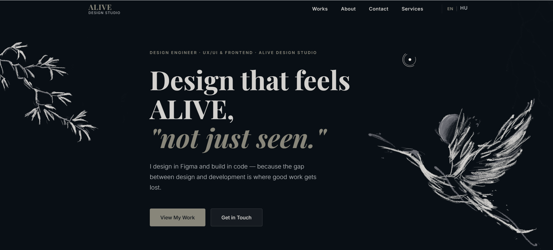
ALIVE
Design Studio
A personal studio website built on clarity, intentional motion, and a design system that reflects how I actually think about design.
The Challenge
Finding the sweet spot between visual and structural.
Many portfolio sites pull in one direction — visually striking but hard to navigate, or structurally solid but flat. I wanted the sweet spot: a site that feels calm and considered, with just enough personality to make it distinctly mine.
As a multidisciplinary designer, I also needed the site to clearly communicate range without feeling scattered — a cohesive system that holds together across different types of work.
Design Goals
What I set out to do.
Objectives
- Present work in a clean, scannable format
- Express a cohesive visual and emotional identity
- Use motion to enhance meaning, not fill space
- Build a flexible foundation that grows with my practice
Constraints
- Personal project scope — no external user testing
- Mobile-first thinking throughout
- Focused feature set to avoid unnecessary complexity
Design Process
Key design decisions.
01
Restraint over decoration
Decorative complexity was cut deliberately. Calm and easy to follow felt more valuable than visually impressive.
02
Intentional visual weight
Large visuals guide the eye without overwhelming. Typography stays concise and well-organized for quick reading.
03
Motion with purpose
Motion appears only where it supports rhythm or gives feedback — never as decoration or a distraction from content.
04
Predictable structure
Reusable layouts, consistent spacing, clear hierarchy, and predictable interactions — components that reinforce trust.
Visual Development
A system built through exploration.
The system is built on two alternating surfaces — a deep dark background and a soft light one — creating natural rhythm across sections. Muted Apres Ski serves as the accent throughout, grounding the palette without overpowering it.
Colour
Typography
Playfair Display — Editorial weight
Inter — Clarity & readability
Motion & Interaction
Present enough to feel alive.
Motion plays a quiet, supportive role. Scroll-based fade-ups, a custom mix-blend-mode cursor, soft hover states, and a glassmorphism navbar — all built in vanilla JavaScript. Animations created in Procreate Dreams, including a looping ALIVE symbol. Present enough to feel alive, restrained enough not to distract.
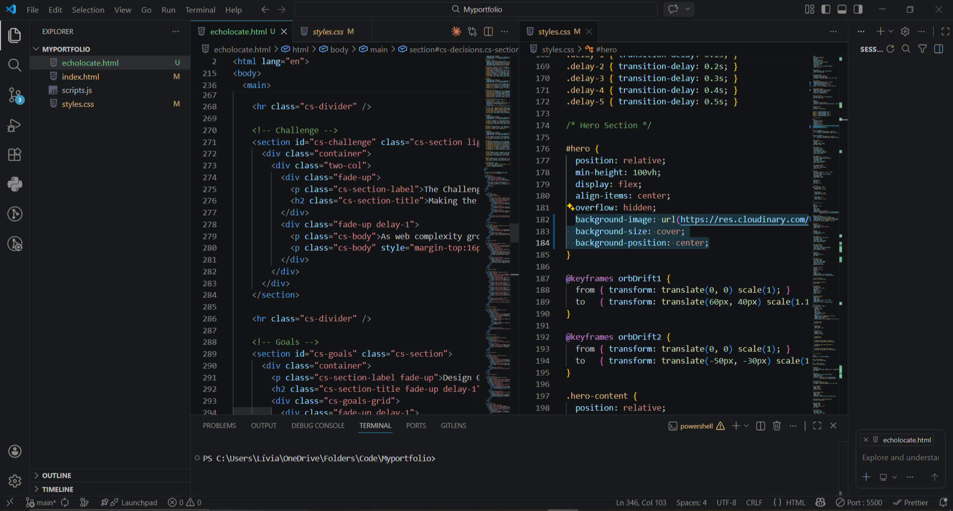
Building It Out
Every line written by hand.
Built entirely in VS Code with vanilla HTML, CSS, and JavaScript — no frameworks. Version-controlled with Git and hosted on GitHub. Writing every line by hand forced clarity in both thinking and execution.
Stack
HTML · CSS · Vanilla JavaScript
Workflow
VS Code · Git · GitHub
Design
Figma · Procreate Dreams
The Result
A calm, structured space.
The final site reflects my design values: clarity, restraint, and intentional interaction. The system is flexible enough to grow into motion, 3D, and interactive media as my practice evolves.
Reflection
What I learned.
This project reinforced how important it is to balance structure with personal expression — and that constraints, when embraced, produce better outcomes.
What went well
- Clear hierarchy made navigation intuitive from the first visit
- Subtle motion added richness without ever distracting
- A restrained system created natural room for future growth
What I'd refine
- Gather real user feedback to validate design decisions
- Explore adaptive motion that responds to user behavior
- Deepen accessibility considerations throughout