Moral Me
A philosophical product deserves a design that thinks as deeply as it does.
Project Overview
The concept is genuinely original. The website wasn't keeping up with it.
Moral Me is a gamified social platform built around character development. It rewards meaningful dialogue and virtuous choices — not follower counts.
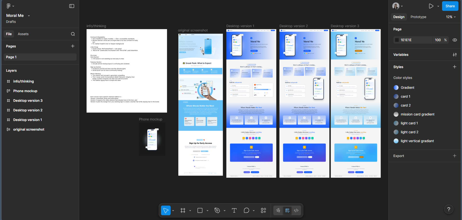
I redesigned the homepage without being asked. Three directions, each with a different strategic rationale. Sent it to the founder cold. He responded the same day.
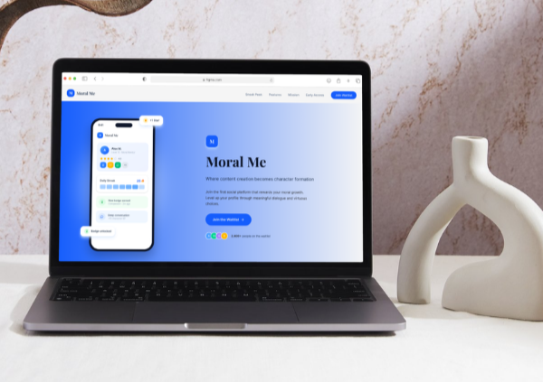
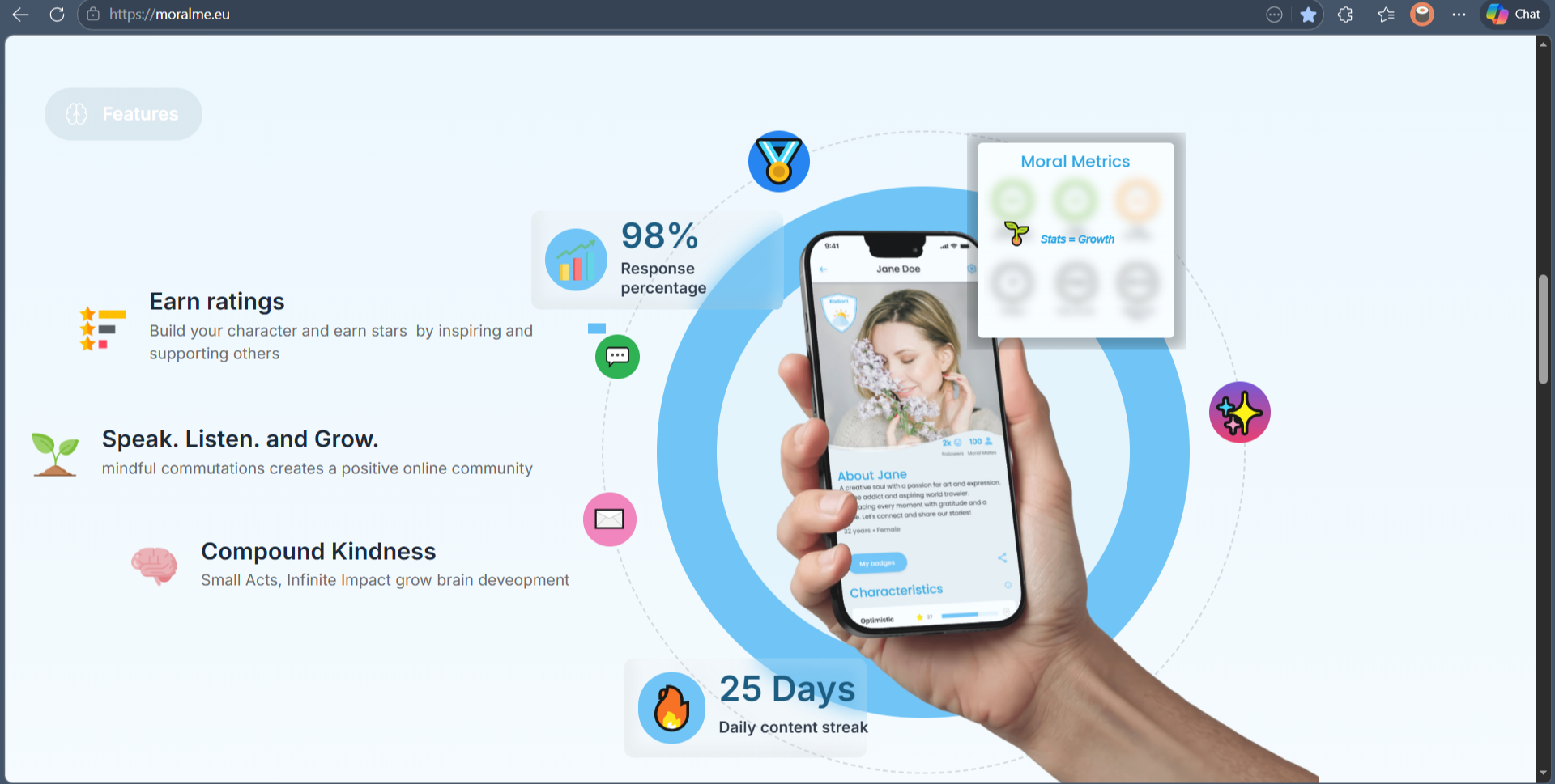
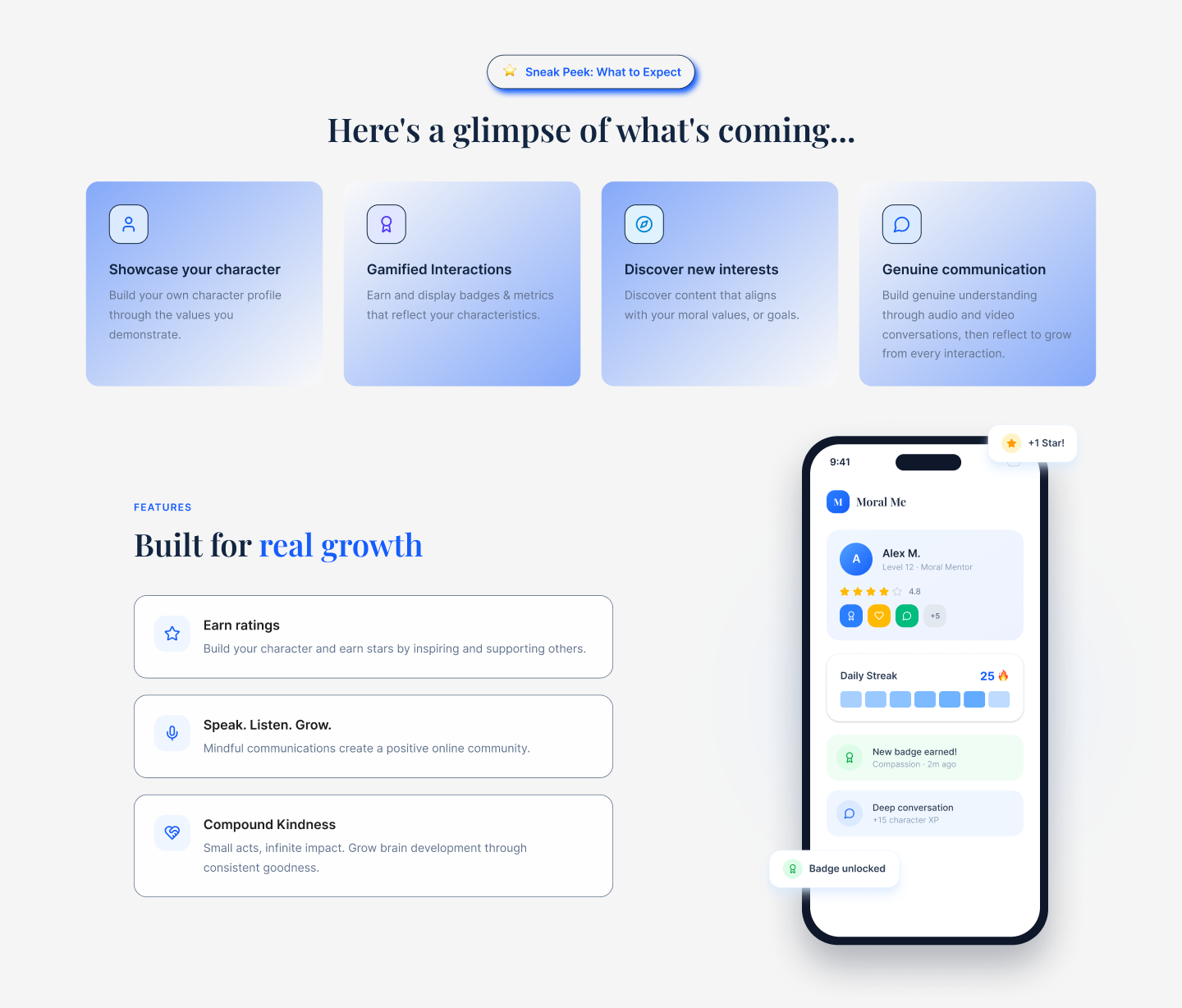
Before
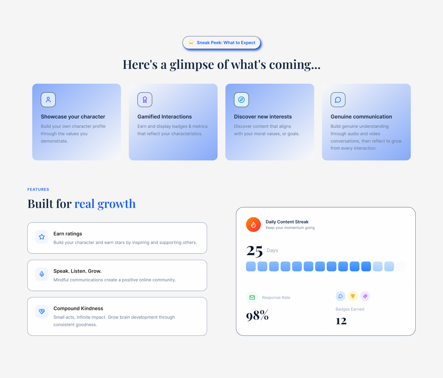
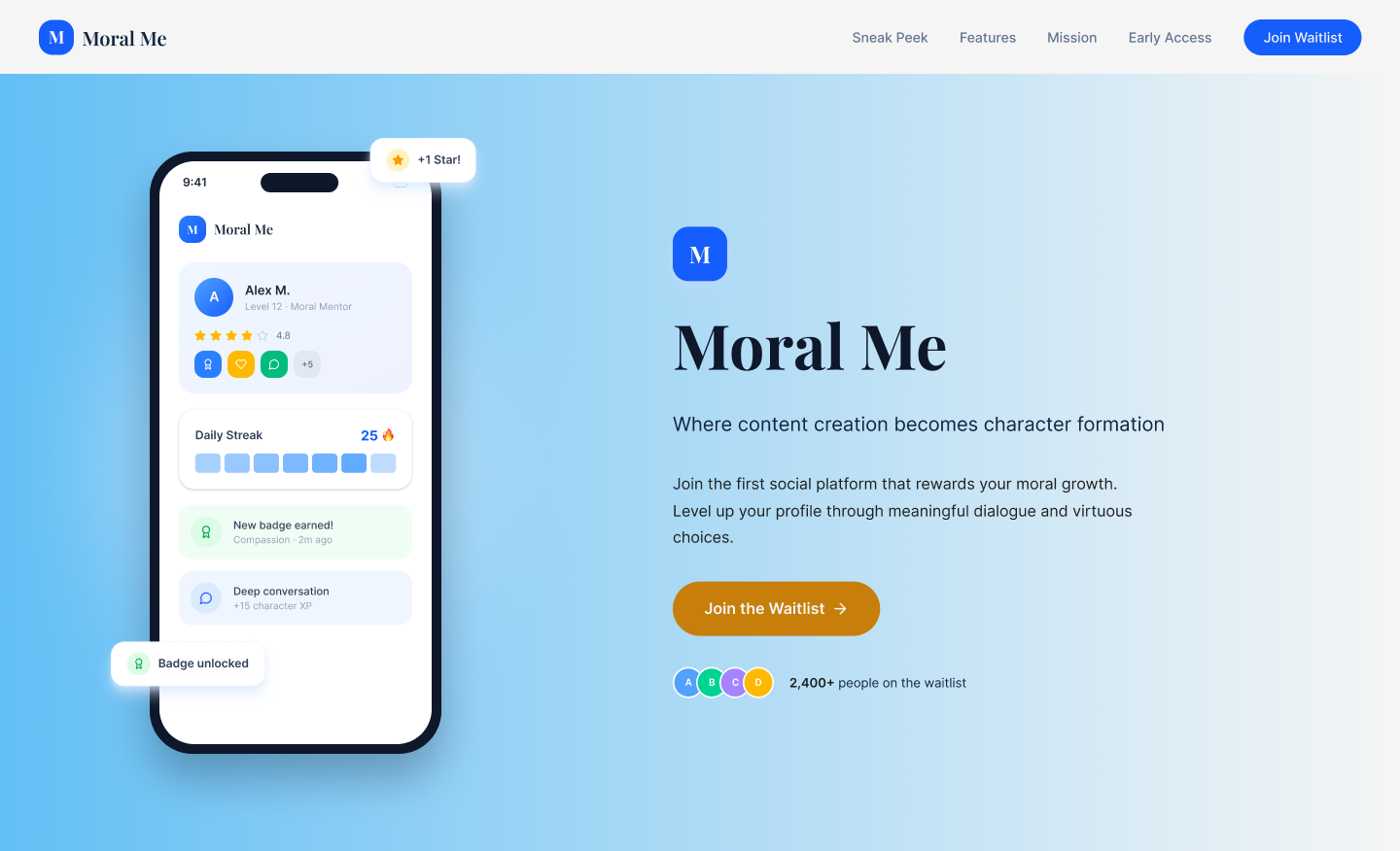
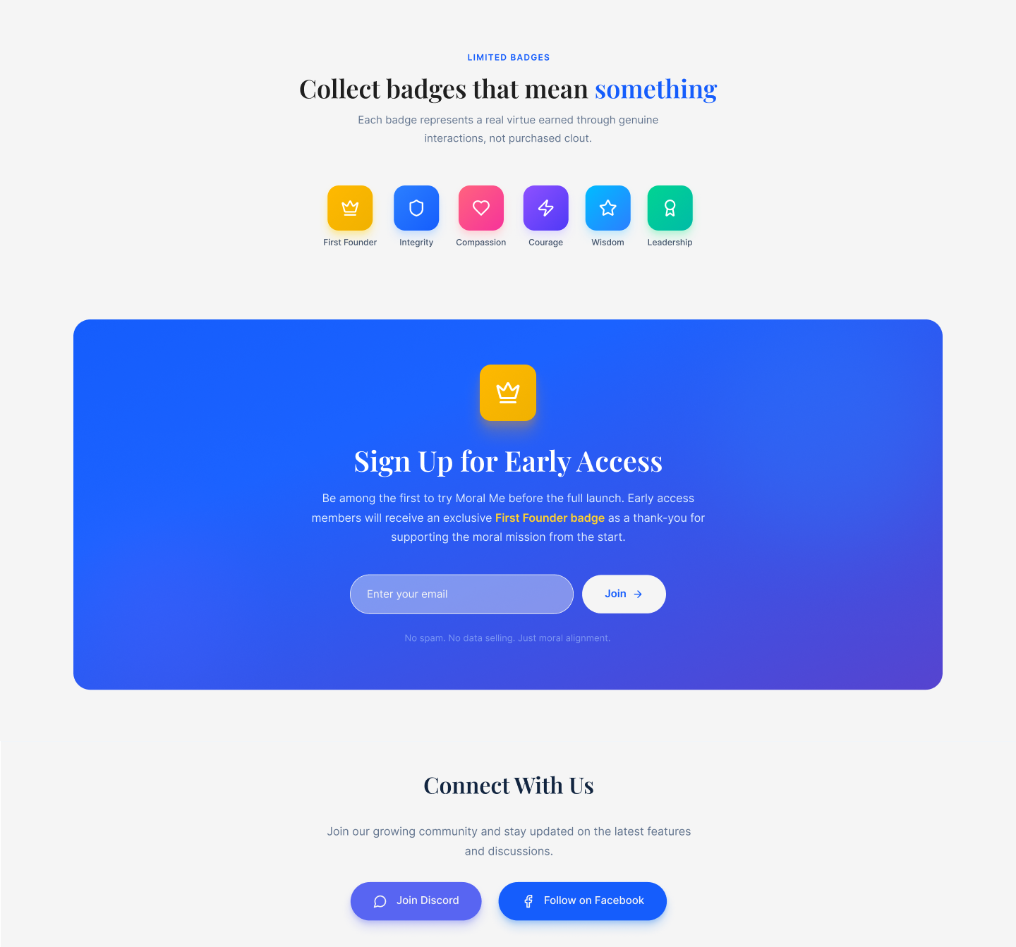
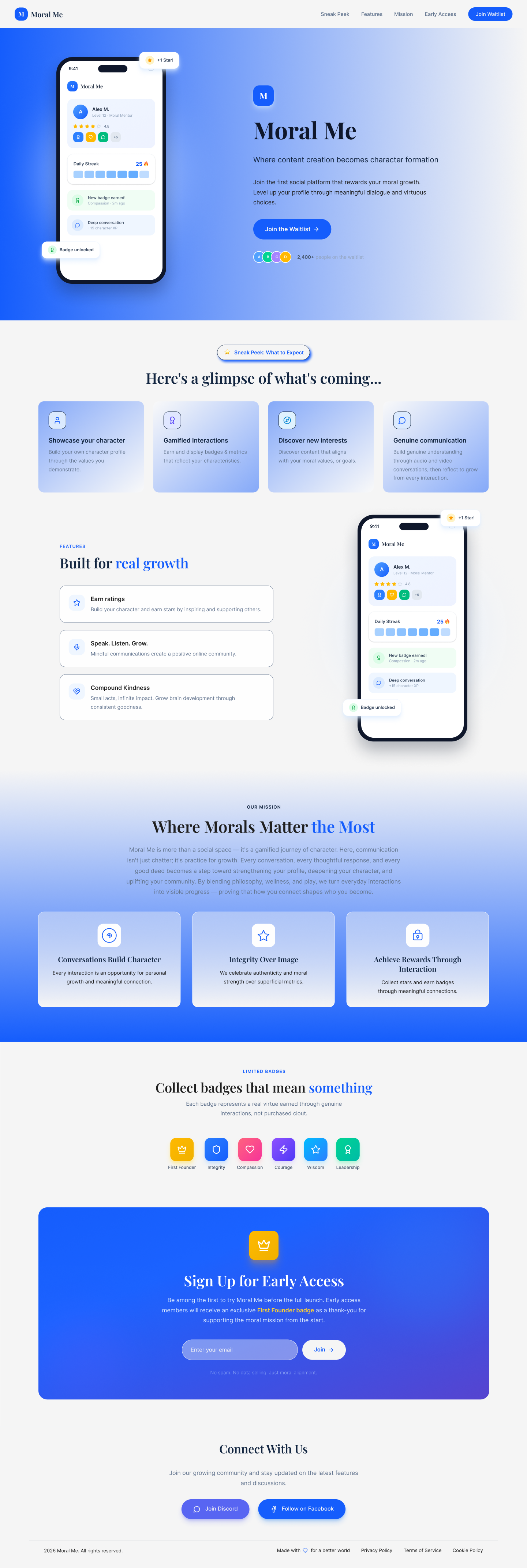
After
Background & Goals
Align the design with the depth of the product.
Moral Me's copy is sharp. "Where content creation becomes character formation" is a strong line. But the design around it told a different story — light blue gradients, floating mockups, generic SaaS layout. It looked like every other app landing page from 2021.
The deeper problem: Kane's writing is philosophical, intentional, emotionally intelligent. The design didn't match that voice at all.
What I set out to do
- Align the visual language with the depth of the product
- Create immediate emotional trust — this platform asks people to be vulnerable
- Make the gamification feel earned, not shallow
- Respect existing brand elements (logo, orange accent) while elevating everything around them
- Deliver three directions to give the founder a real creative choice
Working within
- No brief — I had to write my own
- Existing Framer site structure as reference
- One strong brand asset: the orange in the logo
Research & Inspiration
Moral Me needs to signal depth, safety, growth.
I read everything on the site carefully before touching Figma. The mission, the features, the copy. Moral Me isn't trying to be Instagram. It's closer to a personal development tool with social mechanics layered on top.
The people it's trying to attract are reflective, values-driven. They need to feel understood before they sign up.
The one brand asset worth keeping: the orange in the logo. Warm, human, distinctive. I built all three directions around it — pulling it forward instead of the cool blue that dominated the original.
Closest references
- Duolingo — gamification that feels purposeful, not gimmicky
- Headspace — warmth and trust in a wellness context
- Are.na — intellectual depth, minimal noise
- Medium — writing-forward, ideas over performance
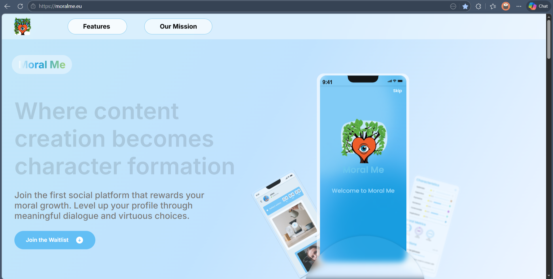
Before
UX Planning & Information Architecture
Before redesigning anything, I audited the existing site.
What I found
- No clear hierarchy — hero, features, mission, and CTA all competing at the same weight
- "PositiveFeed" still in the footer — the old brand name, creating identity confusion
- Copy errors in the features section — typos, inconsistent capitalisation
- Contrast issues — light grey text on white throughout
- Gamification metrics shown raw — numbers without context for what they actually mean
- The robot Ami notice handled with emoji in plain body text — unprofessional first impression
Restructured page flow
The original had no narrative arc. I reorganised it into one — every section earns the next.
Hero — What is this? Why does it matter? One CTA.
Mission — The emotional core in one sentence
How it works — Gamification explained simply
Features — What you actually get
Metrics — Evidence the system works
Waitlist CTA — Low friction, high intention
Visual Design
Three directions. Each a different strategic position.
Version 01
Clarity First
Dark background, orange accent, clean white type. Maximum contrast. Editorial layout. The hero leads with their strongest line set large against a dark field. Orange used in exactly one place: the CTA button. Best for the intellectually serious early adopter.
Version 02
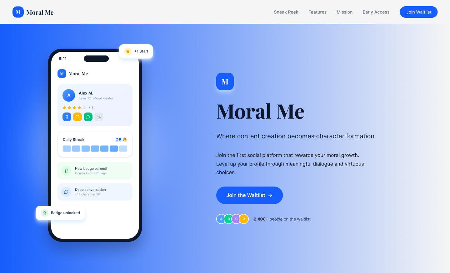
Evolutionary
Keeps the existing video hero and gradient structure. Fixes everything else. Tighter hierarchy. Corrected copy. Stronger contrast. Lowest friction for existing community members. Most buildable in the shortest time.
Version 03
Brand Led
Takes the orange from the logo and makes it the emotional foundation of the entire page. Warm dark background, rich and textured. Leans most directly into the wellness and personal growth angle.
Design Principles Across All Three
Depth over decoration
Nothing decorative that doesn't carry meaning.
Warmth over cold tech
Orange, rounded but not bubbly.
Earned metrics
Gamification numbers shown with narrative, not as raw readouts.
One primary CTA
Always visible, never buried.
Motion & Interaction
Every animation should feel like breathing, not bouncing.
This was a visual concept, not a coded prototype. But interaction intent was considered in every layout decision.
- Hero entrance — slow fade with slight upward drift. The pace should feel considered.
- Metric counters — count-up animation on scroll. Makes the numbers feel earned, not static.
- CTA hover — subtle warm glow, not a flat colour shift. Reinforces the warmth of the brand.
- Feature cards — gentle lift on hover. Light and exploratory, not mechanical.
Development & Platform
The problems were entirely design and copy — not infrastructure.
The "PositiveFeed" footer text was a forgotten template remnant from an earlier brand iteration. Easy to miss. Easy to fix. The kind of detail that erodes trust without anyone knowing why.
All three directions are buildable. Version 1 would benefit most from a considered font pairing — Playfair Display for display headings, Inter for body. Philosophical-meets-functional. Matches the product's voice.
What I Learned
Designing for depth is a different constraint.
Most UX work is about making things simpler. Moral Me needed that — but it also needed to feel weighty. Removing friction can accidentally remove meaning. That tension shaped every decision.
Key insights
- Writing your own brief sharpens your thinking. Without a client, you have to answer the hard question yourself: what does this product actually need right now?
- Lead with feeling, then logic. Emotional trust before feature explanation became the filter for every layout choice.
- Three options is better than one. One solution says you found the answer. Three says you understood the problem from multiple angles.
What I'd refine
- User interviews with the target audience before finalising direction
- A proper mobile-first pass on all three versions
- Prototype the metric animations to test if the gamification reads as meaningful
Outcome
The founder responded the same day.
This is an unsolicited concept. The founder was informed and responded positively.
- Identifying a design problem without being asked
- Strategic thinking across three distinct directions, each with clear rationale
- Brand alignment — reading a founder's voice and translating it visually
- UX auditing beyond surface aesthetics
- The confidence to reach out with real work, not a pitch