Warm Component System
A production-ready design system built from scratch — Figma component library, coded HTML/CSS, and advanced interactions.
The Challenge
Build a system once, built properly.
Most small studios and freelance designers treat every project as a blank canvas — rebuilding buttons, inputs, and navigation from scratch each time. The result is inconsistency, wasted time, and a gap between what's designed and what gets built.
I wanted to solve that problem for myself first. Build a system once, built properly, that could be adapted for any client — and in the process, demonstrate that a designer who codes can deliver something most design-only studios can't.
Design Goals
What I set out to do.
01
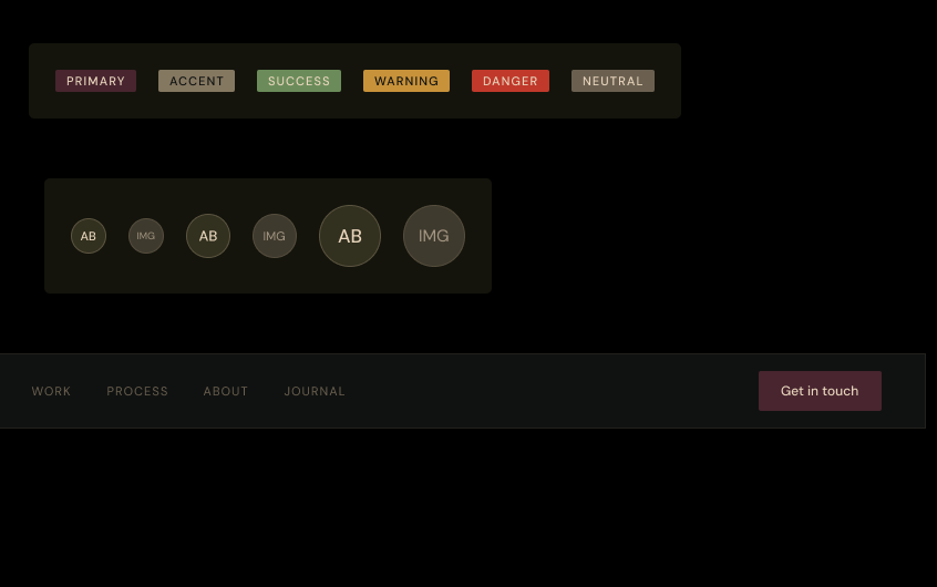
Warmth as a system
Most design systems default to cool, neutral palettes. I wanted to prove a warm, earthy palette — deep olive, burgundy, cream — could be just as rigorous and systematic as any tech-facing system.
02
Design and code as one process
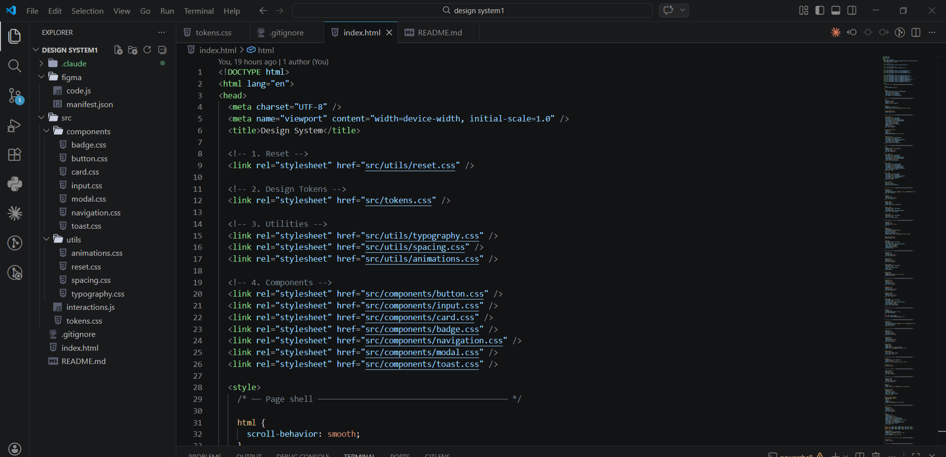
The Figma component library and the coded CSS files were built in parallel, not sequentially. Every design decision had implementation in mind from the start.
03
Real deliverable, not a concept
This is not a mockup of a design system. It is a design system — with working components, CSS custom properties, JavaScript interactions, and documentation a developer can actually use.
Design Process
Key decisions.
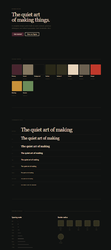
01
Foundations first
Before a single component was designed, the token layer was established — colour, typography, spacing, border radius. Every component inherits from these tokens. Changing a token cascades through the entire system.
02
Typographic contrast as character
Pairing Cormorant Garamond for display with DM Sans for body creates a system with personality — editorial warmth at scale, legibility at the detail level. The contrast between serif and sans-serif mirrors the tension between the palette's organic warmth and its structured grid.
03
Restraint in radius
Maximum border radius of 6px throughout. The warmth in this system comes from colour, not shape. Soft corners would undermine the refined, considered quality the palette suggests.
04
Interactions that feel physical
Hover states are not colour shifts. A magnetic cursor effect pulls elements gently toward the pointer. A liquid gradient border rotates on focus. A shimmer sweeps across cards on hover. Motion is felt, not watched.
The Result
A complete, documented component system.
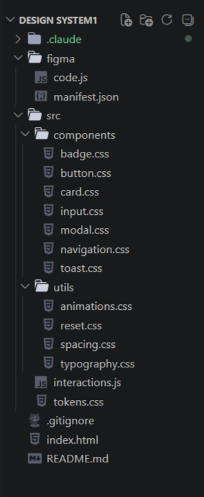
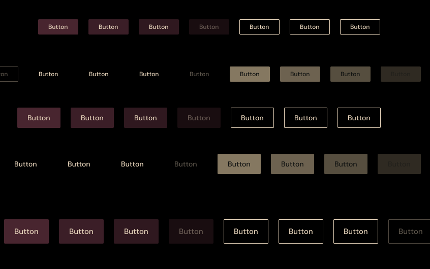
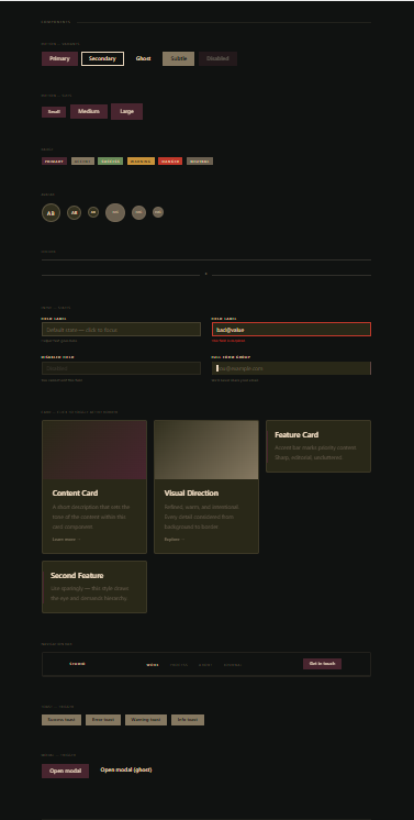
The system includes a Figma component library with full variant and state coverage, a coded implementation with CSS custom properties, seven component files, utility layers, and a live showcase page.
Every interactive state — hover, focus, active, disabled, error — is implemented in CSS with smooth transitions. All animations respect prefers-reduced-motion.
View on GitHub →Reflection
What I learned.
Building a design system end-to-end — from token decisions to deployed code — changes how you think about both disciplines. Design decisions that seemed purely visual turned out to have significant implementation implications. Implementation constraints pushed back on design choices in ways that made the system stronger.
What went well
- Token architecture: changing one value updates the entire system correctly
- The Figma-to-code workflow using Claude Code MCP reduced translation time significantly
- Interactions feel premium without distracting from content
What I'd refine
- Add a dark/light mode toggle with CSS custom property switching
- Build a React component version of the library
- Create a Storybook documentation layer for developer handoff