EchoLocate
A technical accessibility terminal built on binary constraints, semantic logic, and extreme high-contrast systems.
The Challenge
Making the invisible logic of the web visible.
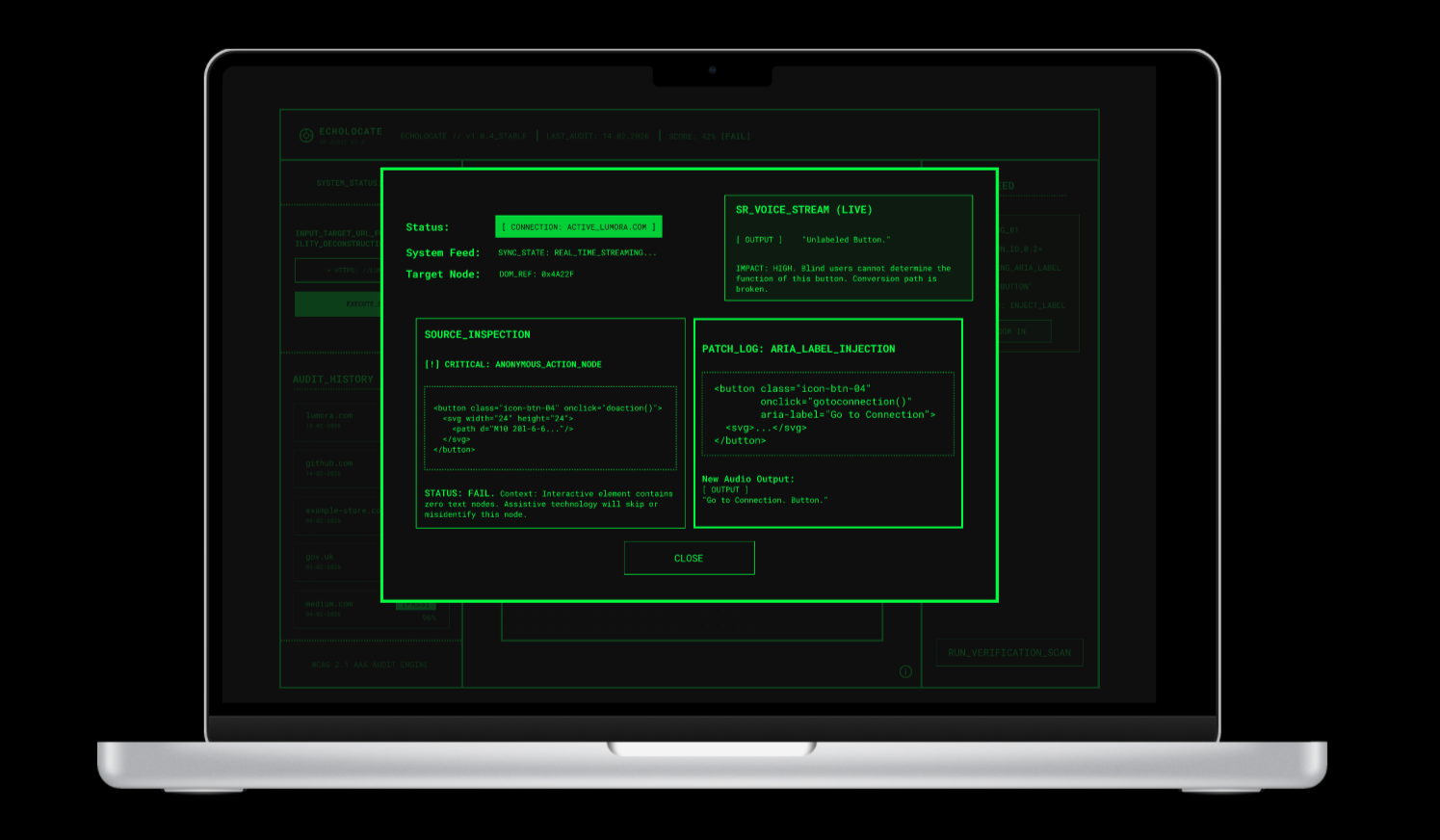
As web complexity grows, accessibility is often treated as a final checkbox rather than a foundational layer. I wanted to design a tool that forces a shift in perspective — stripping away the aesthetic "skin" of a website to reveal the raw, semantic skeleton that screen readers actually navigate.
Many accessibility tools are either too text-heavy for designers or too visual for developers. My goal was to create a terminal environment that makes the invisible logic of the web visible and actionable.
Design Goals
What I set out to do.
Objectives
- Visualize the "Focus Path" as a literal, snaking map
- Identify the "Semantic Void" by highlighting elements lacking descriptive metadata
- Enforce extreme contrast to mirror the software's core mission
- Bridge code and UX with real-time "Virtual Patches"
Constraints
- Binary constraint: strict two-color limit (Terminal Green & Rich Obsidian Black)
- Technical accuracy respecting WCAG 2.1 AAA standards
- Non-visual logic: designing for how computers "hear" sites, not how humans "see" them
Design Process
Key design decisions.
01
Data over decoration
Borders and line weights replace shadows and gradients — every visual element earns its place through function, not aesthetics.
02
"X-Ray" view
Websites rendered as wireframe nodes, removing images and CSS — revealing the semantic skeleton screen readers actually navigate.
03
Active status system
Solid green blocks reserved for high-priority "Live" connections — a strict visual hierarchy that communicates urgency without ambiguity.
04
Binary branding
Every icon custom-built for two-color, high-contrast environments — the visual system itself proves the accessibility it audits.

← Drag to explore →
Visual Development
Terminal aesthetics as a design principle.
The visual identity nods to early terminal interfaces. Using #00FF41 (Terminal Green) on #0F0F0F (Rich Obsidian Black), the interface itself exemplifies the accessibility it audits — exceeding the highest contrast requirements.
Motion & Interaction
Functional motion, not decoration.
Motion is functional, not decorative. Flickering transitions signal critical errors with an authentic "glitch" aesthetic. The verification scan provides immediate visual confirmation as error tags shift to "PASS."
The Result
Accessibility made tangible.
EchoLocate is a high-discipline diagnostic tool that turns accessibility into a tangible, visual experience. By navigating the "Semantic Skeleton," designers identify previously invisible gaps — resulting in fully compliant web experiences.
Reflection
What I learned.
Designing under a two-color constraint reinforced that clarity is a product of hierarchy, not color.
What went well
- Constraint-driven creativity: limiting colors forced mastery of line weight and spacing
- Technical UX: mapping screen reader output deepened understanding of semantic HTML
- Professional utility: the tool feels like functional software, not just a concept
What I'd refine
- Integrate WCAG 2.2 and 3.0 draft standards
- Explore audio design to supplement visual "Audio Preview" transcripts
- Add live API hooks for VS Code or Chrome DevTools integration