Ondine
A landing page that asks you to feel first.
A cinematic concept page for a fictional ocean conservation nonprofit — built around love, not fear.
01 — Why I made this
It started with a feeling, not a brief.
My partner and I dream about sailing one day. But every time we talk about it, the same sad thought comes up: the sea is full of garbage. The thing we want to fall in love with is the thing we're slowly ruining.
Then one day in Amsterdam, I saw a mother and her daughter on paddleboards in the canal, lifting trash out of the water by hand. Such a small thing. Such a good thing. No campaign, no funding, no spotlight — just two people who decided the water was worth their afternoon.
That stayed with me. I wanted to design something that captured that exact feeling: not guilt, not fear, but quiet love for the sea — and the simple belief that protecting it is something ordinary people can actually do.
So I created Ondine, a fictional ocean conservation nonprofit, and designed the landing page I wished more environmental organizations had. One that makes you feel the ocean before it ever asks you for anything.
02 — The Problem
Most environmental sites scare people into closing the tab.
Before designing, I looked closely at how conservation and nonprofit sites usually communicate. Most do the same thing: lead with alarm. Huge scary statistics. Red warning colors. Urgent countdowns. "Act now before it's too late."
The intention is good — but the psychology backfires.
When people are flooded with frightening information, the brain doesn't move toward action. It moves toward self-protection. Faced with overwhelming threat, the nervous system tends toward avoidance and emotional shutdown. Psychologists call it the "finite pool of worry" — we can only hold so much fear before we tune out to protect ourselves.
In plain terms: scaring people doesn't make them help. It makes them close the tab. I wanted to design the opposite of that.
03 — The Core Idea
Make people fall in love first. Then show the stakes. Then show it's fixable. Then invite them in — gently.
Everything about Ondine is built around one emotional journey, in this exact order. It isn't decorative — it's based on how people actually decide to care about something and act on it.
— i.
Awe
Opens people up. Research on awe shows it makes us feel connected to something bigger and more willing to act for the collective good. The site opens with the beauty of the ocean, not its destruction.
— ii.
Meaning
Gives the feeling a reason. Once someone feels something, they're ready to understand why it matters.
— iii.
Reality
Introduced gently, only after the emotional connection exists — so it lands as motivation, not despair.
— iv.
Hope
Immediately follows the hard truth, because people only act on problems they believe can be solved. The site says clearly: this is reversible.
— v.
Action
Comes last, when the person is emotionally ready — and offered kindly, with no pressure.
04 — How design supports the feeling
Every choice carries the same calm.
A site about quiet care for the sea can't move, sound, or look like a fintech ad. Every design decision — palette, motion, copy, structure — had to match the feeling I wanted the visitor to leave with.
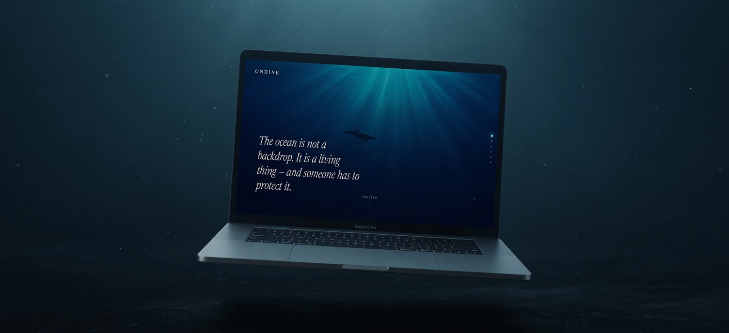
- "The ocean is not a backdrop. It is a living thing — and someone has to protect it."
- "We give animals a second tide."
- "Protection has a price. It's a kind one."
- "Choose what feels right. There's no wrong amount, and no follow-up you didn't ask for."
— i.
You descend as you scroll.
The whole site is built like a dive. The background stays fixed while content moves over it, and the ocean gradually deepens — from sunlit surface to dark, glowing deep. You don't watch the ocean. You're in it.
— ii.
Calm motion, on purpose.
Every animation is slow. Transitions fade gently. Fast aggressive motion triggers alertness; slow predictable motion signals safety. Since the message is calm care, the way the site moves had to match the way it wants you to feel. The medium carries the message.
— iii.
One color that means "alive".
The palette is deep ocean blue. Against all that blue, there is exactly one accent: a soft glowing teal, like bioluminescence. I used it only in the most important moments — the navigation marker and the donation button. Restraint is what gives the accent its power.
— iv.
Words that respect the reader.
The writing is quiet and honest. No guilt, no hype, no corporate language. So much of the internet uses pressure and manipulation. Ondine proves you can ask for help with dignity — and trust people to respond.
05 — The reality, shown gently
One bottle. One line. One quiet truth.
One section names the hard truth. But instead of shocking images of dead animals or piles of waste, it shows a single bottle drifting alone in the deep — and one honest line about how much plastic enters the sea.
This is intentional. One clear, specific image lands more deeply than ten overwhelming ones. The brain processes a single focused thing far better than a flood of horror — and a flood just triggers the shutdown response again. So the section is quiet, almost beautiful, and somehow sadder for it. Then it immediately turns toward hope: it's reversible.
"The ocean asks for so little. Mostly, it asks us to stop making it worse."— Dr. Mara Vinke, Marine Ecologist
06 — What I designed & built
A working front-end demo. Not just a picture.
Designed and coded from scratch — no frameworks, no template. Just HTML, CSS, JavaScript, and decisions.
Designed
- The full emotional journey and page structure
- The visual identity — palette, typography, the bioluminescent accent system
- All section layouts, desktop and mobile
- The copywriting and tone of voice
- Cinematic underwater imagery (AI-generated, then art-directed for a single consistent mood)
Built
- The fixed-background, scrolling-content "descent" effect
- Smooth crossfade transitions between ocean scenes
- The calm, slow animation system
- A scroll-progress indicator
- Fully responsive layout for phone and desktop
- An interactive donation section with selectable amounts
07 — What I'd do next
If Ondine were real.
A landing page is the start of a relationship, not the whole of it. If this were a real organization, the next steps would be: